User:Vasily.podvornyak
Grub2 2.00
Плавая по просторам большой мировой сети, мне не удалось найти руководства по созданию тем оформления загрузчика GRUB2, которое бы помогло мне понять смысл каждого значения и каждой переменной на конкретных примерах. Несмотря на это, когда вы создаёте тему оформления, вы хотите получить конкретный результат. Так, что-бы каждая точка была там, где вам нужно. Вот я и решил написать такое руководство, пока просматривал исходный код. Цель данного руковдства представить каждую возможность графического оформления, показать особенности и ограничения в офомлении загрузчика GRUB2, представить план по созданию новой темы, с точностью до каждого пикселя.
Contents
- 1 С чего начать
- 2 Общие понятия
- 3 Test scheme description
- 4 Properties of elements
- 4.1 Common properties
- 4.2 Root element
- 4.3 boot_menu - boot menu
- 4.3.1 left, top, width, height - coordinates of the rectangle
- 4.3.2 item_color, item_font, selected_item_color, selected_item_font - font and color of boot menu items
- 4.3.3 seleted_item_pixmap_style, item_pixmap_style - items decoration
- 4.3.4 menu_pixmap_style - boot menu decoration
- 4.3.5 item_padding - padding
- 4.3.6 height, item_height, item_spacing - items composition
- 4.3.7 icon-width, icon-height, item_icon_space - icons and icon space
- 4.3.8 Using of icons
- 4.3.9 scrollbar_frame, scrollbar_thumb, scrollbar_width, scrollbar - scrollbar settings
- 4.3.10 visible - don't show boot menu
- 4.4 progress_bar - Horizontal indicator of elapsed time
- 4.4.1 left, top, width, height - coordinates of the rectangle
- 4.4.2 id - identificator
- 4.4.3 text - text, displayed on the progress bar
- 4.4.4 text-color, font - color and font of the text
- 4.4.5 Mono-color and graphical modes of decoration
- 4.4.6 bg_color, fg_color, border_color - for mono-color mode
- 4.4.7 bar_style, highlight_style - for graphical mode
- 4.4.8 Remove decoration
- 4.4.9 visible - do not show progress bar
- 4.5 circular_progress - Circular indicator of elapsed time
- 4.6 label - a string of text
- 4.7 image - Image
- 4.8 vbox - vertical container
- 4.9 hbox - horizontal container
- 4.10 canvas - Canvas
- 5 Common feautures
- 6 Font creation guide
- 7 Parameters which are set outside of theme.txt
С чего начать
И так, мы хотим создать оформление для загрузчика. Давайте пройдём этот путь шаг за шагом.
Создай дирректорию
Сначала, создайте пустую папку для файлов новой темы оформления.
Так же желательно создать подпапку в папке /boot/grub2/themes/
(примечание, предпологается что загрузчик установлен в папку /boot/grub2/)
Пусть это будет папка /boot/grub2/themes/test/
Создайте текстовый файл
Мы должны создать основной файл оформления в только что созданной папке.
Желательно назвать файл theme.txt.
И так - мы создали файл /boot/grub2/themes/test/theme.txt
(в дальнейшем, theme.txt или основной файл оформления file)
Параметр GRUB_THEME в /etc/default/grub
Сто-бы загрузчик включил наше офрмление нужно установить
параметр GRUB_THEME в файле /etc/default/grub.
Иначе говоря, мы должны написать строку GRUB_THEME=/boot/grub2/themes/test/theme.txt.
После знака "=" нужно написать абсолютный путь к основному файлу оформления.
Если строка GRUB_THEME=... уже присутствует в файле/etc/default/grub,
нужно переписать её что бы она была такой GRUB_THEME=/boot/grub2/themes/test/theme.txt.
Не должно быть двух одинаковых строк с одинаковыми параметрами.
Файл настроек загрузчика /boot/grub2/grub.cfg
Изменения в этом файле не будут применены пока мы не пересоздадим файл настроек загрузчика.
Обычно, в системе есть скрипт update-grub2. Он должен быть запущен с правами root.
В случае если такого скрипта нет в системе нужно запустить команду grub2-mkconfig -o /boot/grub2/grub.cfg с правами root.
update-grub2 выполняет точно такю команду.
update-grub2 нужно вызывать всякий раз когда мы внесли изменения в файл /etc/default/grub.
Большинство установок оформления Grub2 описываются в файле theme.txt. Загрузчик Grub2 всяки раз при запуске проверяет этот файл и читает из него настройки. Поэтому мы должны перезапускать машину всякий раз,что-бы увидеть результат наших изменений в файле theme.txt или изменений в папке темы. Скрипт update-grub2 записывает путь к файлу настроек оформления в файл настроек загрузчика.
Общие понятия
Начинаем изучать Синтаксис файла оформления.
Каждый параметр имеет определённый тип.
Вы можете прочитать о типах данных Тут.
Заметьте, что имена общих(глобальных) параметров(опции) и их значений(компонентов) строго определённые. Если будет допущена синтаксическая ошибка в названии параметра или выбран недопустимый параметр, то во время запуска на экран будет выведенна ошибка. Если же было выбрано неверное значение для параметра, то оно не будет примено к параметру и сообщение об ошибке не будет выведено на экран.
Типы элементов
Есть несколько определённых типов:
- корневой элемент
- Верхний уровень theme.txt. Здесь устанавливаются общие параметры
- Меню загрузки (boot_menu)
- Главный элемент. Здесь устанавливаются параметры загрузочного меню.
- Горизонтальный индикатор отсчёта (progress_bar)
- Индикатор оставшегося времени до загрузки раздела меню указанного по умолчанию. Используется горизонтальная панель и текст.
- Круговой индикатор отсчёта (circular_progress)
- Индикатор оставшегося времени до загрузки раздела меню указанного по умолчанию. Используется круговая анимация.
- Текстовая строка (label)
- Отображает текстовую строку.
- Изображение (image)
- Отображает картинку.
- Вертикальный контейнер (vbox)
- Элемент содержащий другие элементы. Отображает елементы столбцом, один за другим, сверху вниз.
- Горизонтальный контейнер (hbox)
- Элемент содержащий другие элементы. Отображает елементы в строку, один за другим, слева направо.
- Холст (canvas)
- Элемент содержащий другие элементы. Для каждого элемента должны быть указаны координаты позиции.
Корневой элемент это экземпляр холста с некоторыми дополнительными параметрами. Он занимает всё пространство экрана.
Изображения
Image is stretched to the defined sized, if these sizes are greater than real image's sizes. Minimal values are real image sizes.
You should take this feature into account while selecting background image. There are several types of displays. The same image can look different on displays with aspect ratio 4:3 and 16:9.
If image is an logotype you should use absolute values for parameters width and height so there won't be any distortions.
Using stretching it is easy to do different kinds of gradients. For example, you could use gradient image 1px width.
Graphical decoration
Graphical decoration of an element consists of 9 zones - central, south, south-west, west etc.
4 diagonal zones (north-west etc) are not stretched.
East and west zones are stretched by vertical.
North and south zones are stretched by horizontal.
Central zone is stretched by vertical and by horizontal.
If there is a diagonal zone in the decoration so there should be both side zones in the decoration, connected with the diagonal zone. E.g. if there is north-west zone, so there should be both north and west zones. Moreover, constant values of the diagonal zone should be equal to corresponding values of side zones. In our example, height of north-west zone should be equal to the height of north zone and width of the north-west zone should be equal to the width of the west zone.
Fonts
Fonts should be created using special utility grub2-mkfont. More detailed information in "Font creating guide"
Test scheme description
decoration elements
Increased in 5 times for better understanding. Alpha-channel - 75%. (transparency)
Dark red background - for clarity.
graphical decoration element
| |
|
|
| |
|
|
| |
|
|
graphical decoration element
| |
|
|
| |
|
|
| |
|
|
| |
|
|
| |
|
|
| |
|
|
scrollbar background

|
| |

|
scrollbar thumb
| |
| |
| |
progress bar decoration
| |
images
central image of circular progress

|
tick image of circular progress
| |
Properties of elements
Complete description of option values with screenshots and schemes.
Common properties
left, top, width, height - coordinates of the rectangle, containing an element.
id - Using special value of element's id affects the way this element will be shown. Using value other than special won't affect anything.
Root element
Root element is the element containing every element of the theme. Also it contains several global options. Root element is an extended canvas element.
Note, that global option name contains minus character ("-", e.g. "terminal-box"), but elements' options contain underline character ("_", e.g. "item_height"). Also note that global options use colon character as the divider (":", e.g. "title_text: "GNU Grub""), but elements options use equal sign character as the divider ("=", e.g. "item_height = 20").
desktop-color, desktop-image - background
First is background color.
Second is background image.
If desktop-image is set then desktop-color is not used.
Image should be placed into the theme's directory.
Image is scaled to the screen resolution.
title-text, title-color, title-font - title settings
Title decor. If the title shouldn't be shown, set title-text="".
Title text is always center aligned and text's baseline is placed at 40 + ascent from the top side of the screen. (see Font creating guide)
title-text: "Title Text"
title-color: "#FFFFFF"
desktop-image: "background.png"
terminal-box - console decoration
Graphical decoration of the console.
Decoration is drawn OUTSIDE of the console rectangle. Coordinates of the console are constant and hard-coded. They can be changed using a patch. See below.
Note, that console is drawn on center slice with 3px padding from each side.
Console background is set in /etc/default/grub. See below.
An image for the console background should not be transparent.
By default there will be black screen.
terminal-font - console font
The name of the font, used in the console.
After a new font has been added to the theme's directory, update-grub2 should be executed.
See more about font's creating in font creating
title-text: ""
desktop-image: "background.png"
terminal-font: "Droid Sans Mono Regular 11"
terminal-box: "inbox_*.png"
Hereinafter, global options are exactly the same.
message-font, message-color, message-bg-color - not used
These parameters can be set, but they aren't used currently.
The main element. Shows the list of installed operating systems. We can select the system we'd like to boot in.
left, top, width, height - coordinates of the rectangle
Standard parameters. Don't forget to set them.
We must understand which item is selected, so it should be highlighted somehow. We can use font, color or graphical decoration. item_color, item_font - color and font of non-active menu items selected_item_color, selected_item_font - color and font of the selected item
+ boot_menu {
        left = 50%-300
        top = 50%-100
        width = 600
        height = 300

        selected_item_color = "#0000FF"
}
See more about font's creating in font creating
seleted_item_pixmap_style, item_pixmap_style - items decoration
The decoration is drawn OUTSIDE of menu item.
By default we can set graphical decoration only for the selected menu item.
In ROSA you could set graphical decoration for non-active menu items.
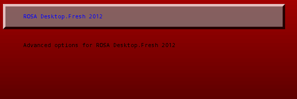
Lets define sizes of selected item's frame as pad_left, pad_top, pad_right and pad_bottom. Full item's height will be item_height + pad_top + pad_bottom - 1.
You should take decreasing by 1 into account to achieve the desired size of the selected item.
+ boot_menu {
        left = 50%-300
        top = 50%-100
        width = 600
        height = 300

        selected_item_color = "#0000FF"
        selected_item_pixmap_style = "button_*.png"
}
Menu decoration is drawn INSIDE the desired rectangle of the element (boot menu). Sized of this decoration are counted for menu items (menu items are drawn in the center slice). It is more complicated for a scrollbar (see below).
item_padding - padding
Sets printing area of boot menu items - rectangle inside central slice of menu's graphical decoration (or entire menu rectangle if no graphical decoration is set) with padding item-padding from each side of central slice edges (or from edges of boot menu's rectangle if no graphical decoration is set).
Note, that item_padding does not affect scrollbar's outfit. Modify graphical decorations of menu and scrollbar if changes in scrollbar padding are needed (e.g. you can add transparent pixels to corresponding areas)
height, item_height, item_spacing - items composition
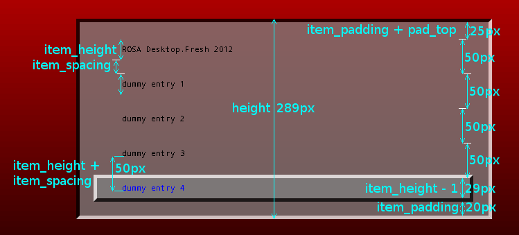
Distance between bottom sides of menu items (see picture) is always item_height + item_spacing.
Note, that formula of shown items number includes menu's frame and item_padding, but excludes pad_top and pad_bottom. (see picture)
height should be count using unobvious formula. N - is the number of items we would like to see. Total height should be equal to
2*item_padding + menu_pad_top + menu_pad_bottom + (N - 1)*(item_height + item_spacing) + pad_top + pad_bottom + item_height - 1
Also note, that minimal number of shown items (N) - is 3.
If height is less then the value, counted with this formula, number of menu items is big enough and the bottom item is selected, then graphical decoration of the selected item won't be drawn completely. if height is greater then the value, counted with this formula, number of menu item is big enough and the bottom item is selected, then the scrollbar's bottom edge will not be aligned with bottom edge of the selected item's graphical decoration.
+ boot_menu {
        left = 50%-300
        top = 50%-100
        width = 600
        height = 289

        selected_item_color = "#0000FF"
        selected_item_pixmap_style = "button_*.png"

        menu_pixmap_style = "inbox_*.png"

        item_padding = 20

        item_spacing = 20
        item_height = 30
}
Height is counted using the given formula.
icon-width, icon-height, item_icon_space - icons and icon space
By default,
icon_width = 32
icon_height = 32
item_icon_space = 4
Text is indented additionally for icon_width + item_icon_space from the left edge of the item's drawing area. In other words, free space for an icon is always left independently of is there an icon to be drawn or not.
If this behavior is unwanted you should null icon_width and set desired value for item_icon_space.
Also note, that width of menu items is decreased by 2 pixels. That way, we will see additional 2 pixels of free space from the right edge of east slice of the menu.
Note, that font's symbols can include empty pixels from either side. E.g. in out test scheme, distance from the left edge is 36 by default (icond_width + item_icon_space), but distance to the first pixel of the first symbol is 37.
Using of icons
If you'd like to use icons you should make directory image in the theme directory.
Then you should place icons in png format to the directory image. Icon's name should correspond to some predefined class.
Default classes:
- windows > os
- gnu-linux > gnu > os
- osx > darwin > os
- hurd > gnu > os
More important class is to the left. If icon windows.png is found then it will be shown. The icon os.png will not.
Main system's class (equal to it's name) will be available also. (main system in this case - is the system where update-grub2 script was called). This class is more important than gnu-linux.
E.g. for ROSA system this class will be "rosa" etc. You can find classes in the file /boot/grub2/grub.cfg.
With patch applied to ROSA, such class will be shown for every other installed OS on the particular computer.
scrollbar_frame, scrollbar_thumb, scrollbar_width, scrollbar - scrollbar settings
Let's see detailed information about scrollbars.
- Do not use slices different from north, south and center for scrollbar_thumb.
- You could use all 9 slices for scrollbar_frame.
- You can increase padding from any side of the scrollbar by adding transparent pixels to the corresponding slice.
- Scrollbar is drawn to the right of the center slice. So, if we don't have menu's graphical decoration or there isn't east slice in the menu's graphical decoration we won't see scrollbar even if it's needed.
- Scrollbar is drawn only if needed.
- Note that width of the boot menu is decreases by 2 pixels (from maximum width). Because of that distance between menu items and the scrollbar is always at least 2 pixels.
- You have to set both scrollbar_frame and scrollbar_thumb. If one of these parameters isn't set you won't see the scrollbar.
- Width of scrollbar_frame and width of scrollbar_thumb can be different.
- scrollbar_frame is drawn in the east slice of menu's graphical decoration. scrollbar_thumb is drawn entirely in the center slice of scrollbar_frame.
- scrollbar_width - width of the scrollbar. It means width of the central part of scrollbar_frame. If sum of scrollbar_width and widths of east and west slices of scrollbar_frame are less than width of the east slice of menu's graphical decoration, then the scrollbar won't be drawn completely.
- You could set value False for scrollbar. In that case the scrollbar won't be shown. Alternative: just don't set parameters scrollbar_thumb and scrollbar_frame.
- As it was said before, item_padding don't affects the scrollbar.
In this example there are no additional pixels for the scrollbar in the east slice of menu's graphical decoration.
+ boot_menu {
       left = 50%-300
       top = 50%-100
       width = 600
       height = 289

       selected_item_color = "#0000FF"
       selected_item_pixmap_style = "button_*.png"

       menu_pixmap_style = "inbox_*.png"

       item_padding = 20

       item_height = 30
       item_spacing = 20

       scrollbar_thumb = "scrollbar_thumb_*.png"
       scrollbar_frame = "scrollbar_frame_*.png"
       scrollbar_width = 10
}
As we can see, scrollbar isn't completely drawn.
In this example we have changed menu's graphical decoration. We'll use this configuration of the boot menu hereinafter. boot_menu.
+ boot_menu {
       left = 50%-300
       top = 50%-100
       width = 600
       height = 289

       selected_item_color = "#0000FF"
       selected_item_pixmap_style = "button_*.png"

       menu_pixmap_style = "menu_*.png"

       item_padding = 20

       item_height = 30
       item_spacing = 20

       scrollbar_thumb = "scrollbar_thumb_*.png"
       scrollbar_frame = "scrollbar_frame_*.png"
       scrollbar_width = 10
}
Now the scrollbar is correctly displayed. Also we can see that item_padding does not affect the scrollbar.
We can set value False for the visible property. That way the boot menu won't be shown. Alternative: do not describe boot_menu component in the main theme file.
progress_bar - Horizontal indicator of elapsed time
This element displays elapsed time to execution of the default entry.
Progress starts from non-zero length.
left, top, width, height - coordinates of the rectangle
Standard parameters. Don't forget to set them.
Note that if width or height is less than needed to display the given text then width or height will be auto-increased.
id - identificator
To display countdown (visually or textually) you should set predefined value to id.
id = "__timeout__"
text - text, displayed on the progress bar
Text to output on the countdown indicator. There are several predefined special values. They have special meaning and are translated to different languages.
- @TIMEOUT_NOTIFICATION_SHORT@ for "Ns"
- @TIMEOUT_NOTIFICATION_MIDDLE@ for "Ns remaining."
- @TIMEOUT_NOTIFICATION_LONG@ for "The highlighted entry will be executed automatically in Ns."
N is an amount of seconds to execution of the default entry. The string is updated every second. Also you can set any constant text value.
text-color, font - color and font of the text
Font and font color of the text string, printed on the indicator.
See more about font's creating in font creating
Mono-color and graphical modes of decoration
There are 2 options of decoration:
- mono-color mode, with areas filled with fixed colors and 1px border
- graphical mode, with graphical decorations
If one of the options for graphical decoration is used then will be turned on the second option. Otherwise the first option will be used.
See detailed information below.
bg_color, fg_color, border_color - for mono-color mode
+ progress_bar {
        left = 50%-300
        top = 50%+200
        width = 600
        height = 50

        id = "__timeout__"
        text = "@TIMEOUT_NOTIFICATION_LONG@"

        border_color = "white"
}
Default value are used in this example:
bg_color = "128, 128, 128"
fg_color = "200, 200, 200"
bar_style, highlight_style - for graphical mode
Note, it is recommended to use only central slice for the highlight_style parameter. Otherwise the countdown indicator will be shown incorrectly.
Note, using of any of these parameters turns on the graphical mode.
+ progress_bar {
        left = 50%-300
        top = 50%+200
        width = 600
        height = 50

        id = "__timeout__"
        text = "@TIMEOUT_NOTIFICATION_LONG@"

        bar_style = "inbox_*.png"
        highlight_style = "progress_*.png"
}
Remove decoration
If you'd like to remove decorations so only the text string will be shown you should set equal values to bar_styly and highlight_style.
The value can be any text value. This is not necessary for the value to be the name of some real graphical decoration.
The value must include the symbol "*".
In the following example text color is "white".
+ progress_bar {
        left = 50%-300
        top = 50%+200
        width = 600
        height = 50

        id = "__timeout__"
        text = "@TIMEOUT_NOTIFICATION_LONG@"

        text_color = "white"

        bar_style = "*"
        highlight_style = "*"
}
visible - do not show progress bar
You could set the value False to this parameter. That way progress bar won't be shown. Alternative: just don't use progress_bar element in the main theme file.
circular_progress - Circular indicator of elapsed time
Circular indicator of elapsed time shows graphically the elapsed time to executing the default entry.
Elapsed time is displayed with drawing ticks.
If ticks_disappear isn't set then ticks are appearing (along the circumference, clockwise) until the circle is completed.
If ticks_disappear is set then ticks are disappearing.
Number of drawn ticks is always decreased by 1. Some ticks can be drawn at the first state. (circular indicator starts filling from non-zero value)
left, top, width, height - coordinates of the rectangle
Standard parameters. Don't forget to set them.
It is recommended to set similar value to width and to height. Detailed information about rectangle coordinates features see below.
id - identificator
To display countdown you should set predefined value to id.
id = "__timeout__"
center_bitmap, tick_bitmap - images for the circular progress indicator
Central image neither scaled or turned. It's drawn in the center of the desired rectangle of the element. If the image is less than the rectangle then part of the image won't be drawn. It's the background of the indicator.
Tick image also doesn't scaled or turned. It's drawn multiple times circumferential. The circle is inscribed into the desired rectangle.
It's recommended to use square images (height and width are the same).
Calculations use elements' width and tick's width.
If width of the element is greater then it's height then some ticks won't be drawn.
It tick's height is greater then it's width then ticks won't be completely drawn.
It's recommended to make tick's width the same parity as element's width. (only in that case we will have correct symmetrical displaying)
num_ticks, start_angle, ticks_disappear - circular progress settings
num_ticks - The number of ticks to make a full circle.
start_angle - The starting angle. (starting from x-axis). It's measured in "parrots". One "parrot" - 1/256 of the full circle. That way -90 degree (or -π/2) will be -64 "parrots".
tick_bitmap is drawn without any changes (no turning, no scaling etc) and angles are measured (in the algorithm) in "parrots" so it's recommended to set num_ticks with values equal to n-th power of 2. That way we will have smooth and symmetrical picture.
ticks_disappear - by default ticks are appearing.
You could set value True for ticks_disappear parameter. In this case ticks will disappear until none of them are present.
ticks_disappear = "True"
Note, that number of drawn ticks is alway decreased by 1.
Example
+ circular_progress {
        left = 50%-450
        top = 50%+310
        id = "__timeout__"
        width = 51
        height = 51
        center_bitmap = "center.png"
        tick_bitmap = "tick.png"
        num_ticks = 8
}
label - a string of text
We can display a line of text using label element.
If special values for id and text are set then elapsed time to execution of the default entry will be shown.
Note that there is not line-breaking mechanism. If printing length of the text line is greater then rectangle's width will be increased.
left, top, width, height - coordinates of the rectangle
Standard parameters. Don't forget to set them.
Note that width is used only for aligning the text if align parameter have value of "center" or "right".
Note also that height isn't used.
font, color - color and font of the text
Font and color of the text.
See more about font's creating in font creating
align - aligning
Three correct values are available:
- left - align the text by the left edge of the element
- center - align the text by center of the element
- right - align the text by the right edge of the element
Show elapsed time to booting the default item
To show the elapsed time we should set special value of id and the parameter text should not be present in the description of the element in the main theme file.
+ label {
        left = 50%-350
        top = 50%+260
        height = 30
        width = 30

        id = "__timeout__"

        color = "white"
}
text - shown text
We can output any text message. There are several special values:
- @KEYMAP_SHORT@ for "enter: boot, `e': options, `c': cmd-line"
- @KEYMAP_MIDDLE@ for "Press enter to boot the selected OS, `e' to edit the commands before booting or `c' for a command-line."
- @KEYMAP_LONG@ for "Press enter to boot the selected OS, `e' to edit the commands before booting or `c' for a command-line. ESC to return previous menu."
Special values are translated to the language, used in GRUB.
Note that there is no line-breaking mechanism and text line's width isn't limited.
Example with common value of text
+ label {
        left = 50%-300
        top = 50%+220
        height = 30
        width = 600

        color = "white"

        align = "right"

        text = "Some text."
}
Example with special value of text
+ label {
        left = 50%-300
        top = 50%+220
        height = 30
        width = 600

        color = "cyan"

        align = "center"

        text = "@KEYMAP_SHORT@"
}
image - Image
An image can be displayed on the screen.
If image's height is less than defined height, then defined height will be set to the image's real height. The same works for the image's width.
If defined width or height are greater than image's real width or height (correspondingly) then the image will be stretched to the defined size.
left, top, width, height - coordinates of the rectangle
Standard parameters. Don't forget to set them.
If you'd like to display unchanged image just don't set width and height parameters - they will be set automatically.
file - full path to the image file
Full path to the image file.
vbox - vertical container
Container. Parent element which contains other elements.
left, top, width, height - coordinates of the rectangle
Don't forget to set left and top parameters. height and width are ignored and will be redefined so you don't need to set them.
Composition of contained elements
Elements, contained in the vertical box are shown consequentially from top to bottom.
You don't need to set left and top parameters for child elements - these values won't be taken into account.
Maximum of child elements' widths is being counted, then all widths (widths of every child element and the container) vertical are set with the resulting value.
Values of child elements' heights aren't change.
Example
+ vbox {
        left = 50%+310
        top = 50%-50
        width = 20
        height = 100

#D1
        + image { left = 50 top = 10 width = 60 height = 60 file = "center.png" }
#D2
        + image { left = 40 top = 20 width = 70 height = 70 file = "button_n.png" }
}
hbox - horizontal container
Container. Parent element which contains other elements.
left, top, width, height - coordinates of the rectangle
Don't forget to set left and top parameters. height and width are ignored and will be redefined so you don't need to set them.
composition of contained elements
Elements, contained in the horizontal box are shown consequentially from left to right.
You don't need to set left and top parameters for child elements - these values won't be taken into account.
Maximum of child elements' heights is being counted, then all heights (heights of every child element and the container) are set with the resulting value.
Values of child elements' widths won't change.
Example
+ hbox {
        left = 300
        top = 50%+310
        width = 20
        height = 100

#D1
        + image { left = 50 top = 10 width = 60 height = 60 file = "center.png" }
#D2
        + image { left = 40 top = 20 width = 70 height = 70 file = "button_n.png" }
}
canvas - Canvas
Container. Parent element which contains other elements. Child elements' coordinates are relative. That way, (0,0) for a child element is coordinates of top left corner of the container.
Root element is an instance of canvas.
left, top, width, height - coordinates of the rectangle
Standard parameters. Don't forget to set them.
Common feautures
Common features not related to some concrete subject.
Elements' drawing order
Elements are drawn consequently from top to bottom in a vertical box.
Elements are drawn consequently from left to right in a horizontal box.
Child elements for a canvas are drawn in reverse order. If element A in placed before element B in the main theme file then A will be drawn after B.
Element's drawing zone
There is drawing area defined for each element. It is set with parameters left, top, width, height.
Everything that crosses the defined area won't be drawn.
Element's minimal size
Each element have a function for determination of the minimal size of the rectangle enough to draw this element. If defined width (height) is less then minimal width (height) then defined width (height) will be redefined to the minimal value.
What if number values are incorrect
Description of numeric values.
Note, that absolute and relative values are counted relative to the parent container.
Lets call width and height of the parent container parent_width and parent_height correspondingly.
It left or top are negative - it will be redefined to 0.
If left + width is greater than parent_width then width will be redefined to parent_width - left. That way, right edge of the element will match right edge of the parent container.
If top + height is greater than parent_height then height will be redefined to parent_height - top. That way, bottom edge of the element will match bottom edge of the parent container.
We can use this features to achieve different composition of elements on different screen resolutions.
Choosing of symbol
The font of an element is described in the main theme file. If the desired font hasn't been found or the desired symbol isn't contained in the desired font - the most appropriate symbol from another font (present in the theme) will be used.
For example border symbols aren't present in some fonts. If we've selected such font to be the font of the console then border symbols will be taken from another font. Knowing this feature help to avoid confusion about unexpected results (e.g. dashed border or question mark symbols in place of the border)
Font creation guide
GRUB uses it's own font format. Needed font can be created using the utility grub-mkfont
After the font has been created and placed into the theme's directory, utility grub2-update should be executed so the changes will be applied.
Create font using grub2-mkfont
GRUB don't use kerning (changes of the distance between the symbols in case of some character combinations).
File, resulting from execution of the utility should necessarily have the extension .pf2
Syntax:
grub2-mkfont INPUT_FONT [optional parameters] -o OUTPUT_FONT
Resulting file should be placed into the theme directory.
Parameters of grub2-mkfont
--output, -o
Necessary parameter. The name of the resulting file. Should have extension .pf2 so the font can be used by GRUB.
--verbose, -v
grub2-mkfont DroidSansMono.ttf -o tmp.pf2 -v
Font name: Droid Sans Mono Regular 16
Max width: 13
Max height: 17
Font ascent: 17
Font descent: 5
Number of glyph: 591
Display information about the created font.
Displays name, maximum width and height, ascent and descent of the font, quantity of symbols.
--name, -n
Set the font's name.
By default, font's name is auto-created with template: FONT_NAME TYPE SIZE
--size, -s
Set the font's size in pixels.
The value is 16 by default.
--bold, -b
Output bold font.
It is normal by default.
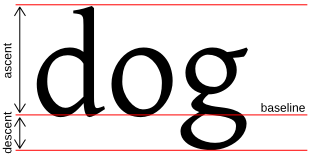
ascent, descent of the font
--asce, -c
ascent of the font (see picture)
--desc, -d
descent of the font (see picture)
We can set these parameters to achieve larger \ lesser line spacing, to align the baseline (see picture). If we are going to set these parameters we should watch carefully that every needed symbol is correctly displayed.
Select range of symbols to encode
We can set a range of symbols to encode.
--ascii-bitmaps
to encode only ascii symbols
--range, -r
to encode the given range of symbols
Parameters which are set outside of theme.txt
Options, which are set outside of the main theme file.
/etc/default/grub File
GRUB_THEME
Full path to the main theme file.
GRUB_BACKGROUND
Full path to the background image of the console. This file should be non-transparent. It's stretched to the sizes of the console. (note the 3px border)
LANG и LANGUAGE
If you'd like to set a language used in GRUB you should set both this parameters to the same value.
Different syntax can be used: en, en_US, en_US.UTF-8.
Vladimir Testov, ROSA, 2013.

